


Maintaining visual consistency across a product ecosystem breaks even the best design teams. You start with open-source packs like Feather or Heroicons, and everything works fine-until you hit a wall. The library covers “user” and “settings” perfectly, but fails when you need specific concepts like “biometric security” or “database migration.”
You end up with a “Frankenstein UI”: a mix of clean open-source vectors and hastily drawn custom assets. The stroke widths don’t match. The corner radii are off.
Icons8 approaches this problem differently. It treats icons as a strict design system, not just a repository. With over 1.4 million assets, the value isn’t just volume; it is depth. Instead of aggregating disparate icons from thousands of authors, Icons8 maintains massive packs (often 10,000+ icons per style) produced by a single in-house team.
Here is how this single-source approach impacts workflow, design systems, and developer handoff.
The Architecture of Consistency
Design leads face a tough choice: hire a full-time iconographer or accept visual chaos. Icons8 offers a third option by strictly adhering to major platform guidelines.
Building for iOS? The library offers over 30,000 icons mapped to iOS 17 specifications, broken down into Outlined, Filled, and Glyph variants. Windows developers get 17,000+ icons matching Windows 11 guidelines. Teams can adopt a native look immediately without memorizing Apple’s Human Interface Guidelines or Microsoft’s Fluent Design System.
For projects requiring flair, styles like “3D Fluency” or “Liquid Glass” offer high-fidelity aesthetics. Manually rendering these in Blender takes hours. Because Icons8 standardizes them, you can drop a 3D folder next to a 3D user icon and the lighting, perspective, and material properties align automatically.
Scenario 1: The Enterprise Dashboard Overhaul
Take a team migrating a legacy B2B SaaS platform to a modern React framework. The application is data-heavy. It requires hundreds of distinct symbols for financial instruments, data visualization types, and administrative actions.
The Workflow
The lead designer selects the “Material Outlined” style (5,573 icons) to align with the company’s Google Material-based system. Single downloads are inefficient here. Instead, they use “Collections.” They create a group named “Dashboard V2” and start searching.
Synonyms work well. Searching for “revenue” brings up charts, currency symbols, and growth indicators. When a specific metaphor is missing, the designer uses the “Request” feature. Eight community upvotes usually trigger production.
Once the collection is populated, the bulk recolor tool changes the game. The designer applies the primary brand hex code to the entire set instantly. Finally, they export the collection as an SVG sprite or icon font. Engineering receives a single, optimized asset file rather than hundreds of loose SVGs, keeping the codebase clean and HTTP requests low.
Scenario 2: The Rapid Mobile MVP
Picture a startup building an iOS fitness tracking application. They have a two-month runway. They need to look native to the Apple ecosystem to build trust, but they lack the budget for a dedicated illustrator.
The Workflow
The developer installs the Icons8 Figma plugin. Inside the design file, they select the “iOS 17 Glyph” style. As they build the onboarding flow, they realize static icons aren’t enough to explain features effectively.
Filtering by “Animated” reveals Lottie JSON files matching the static icons already placed. They download a “heart rate” animation and a “running” animation. Since these are Lottie files, they remain vector-based and sharp on high-density Retina displays.
For the tab bar, the icons need a specific weight. The developer opens the selected assets in the in-browser editor, adjusts the padding to meet touch target accessibility standards, and downloads the modified SVGs. The result looks like it was built by a team twice the size.
A Day in the Workflow: The Marketing Deck
Here is how the tool functions in a non-technical narrative.
You are a content manager creating a pitch deck. You open Pichon, the Mac app sitting in your menu bar. You need an icon for “global logistics.” Searching “globe” returns results in fifty different styles. You filter for “Office” to match your clean, corporate template.
The globe you find is too simple. You drag it into the built-in editor. You decide to add a background element. You click the “Square” option, change it to a circle, and give it a soft blue fill. You place the globe icon on top and change the icon color to white.
Now you need to denote “secure logistics.” Using the “Subicon” feature, you search for a lock. You drop a small shield padlock onto the bottom right corner of the globe. It snaps into place automatically. You drag the final PNG directly from the app into your Keynote slide. The whole process took less than two minutes.
Comparing the Alternatives
Icons8 vs. Open Source (Feather, Heroicons)
Open-source packs are excellent for their price (free) and code quality. But they are shallow. You will likely find a “home” icon, but you won’t find “invoice-recurring” or “user-access-denied.” Icons8 wins on depth; open source wins on zero cost.
Icons8 vs. The Noun Project
The Noun Project aggregates thousands of designers. While the variety is immense, the consistency is poor. One “dog” icon might be a thin line drawing, while another is a cartoonish sketch. Icons8 creates assets in-house, ensuring the stroke width of a “dog” matches the “cat” perfectly.
Icons8 vs. Custom Design
Custom design offers total ownership. It is also slow and expensive. Icons8 is a rental model-you get speed and consistency, but you sacrifice exclusivity.
Limitations and When to Avoid
No tool is a universal solution.
- Uniqueness: Use the “Popular” or “Color” styles, and your app will look like thousands of others. Brands relying on distinct visual differentiation may find stock icons dilute their identity.
- Vector Paywalls: The free tier is generous with PNGs up to 100px. Scalable vectors (SVG) are locked behind the paid plan. Zero-budget projects needing scalable print or web assets will hit a blocker here.
- Attribution: Free plans require a link back to Icons8. This works on a blog but feels clumsy in a native mobile app or printed brochure.
- Editor Limits: The in-browser editor handles quick fixes well, but it doesn’t replace Illustrator. You cannot manipulate individual anchor points without downloading the SVG and opening it in dedicated software.
Practical Tips for Power Users
Use the “Paste” Feature
Don’t rely solely on the library. You can paste your own SVG data into the editor to manage collections, though native assets handle editing best.
Check “Simplified SVG”
Keep the “Simplified” box checked when downloading SVGs for web use. This optimizes paths to reduce file size. Uncheck this box only if you plan to animate the icon paths yourself using CSS or JS later.
Explore Beyond Standard Icons
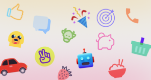
Look past standard UI elements. The emojis set offers 2,000+ icons providing a consistent, flat aesthetic. This is useful for chat applications where you want reactions to match your specific color palette rather than the default OS style.
Use the CDN for Prototyping
For quick web prototypes, use the “Link (CDN)” option. Embedding the icon via a script tag speeds up the dev-to-staging process significantly. Avoid this in high-traffic production environments due to external dependencies.
Summary
Think of Icons8 as a “consistency engine” rather than just a download site. It solves visual fragmentation by offering massive, single-author packs that adhere to strict platform guidelines. You have to pay to unlock the full vector workflow, but the time saved on drawing and hunting for matching assets usually offsets the monthly cost.
Recommended Reading:
Understanding the Difference Between Database Sharding and Partitioning
Ghibli Images Can Be Risky. Here’s What You Need to Know Before Generating Aesthetic Images
Database Management System Software Perform Operations Like Creating, Storing or Deleting Data