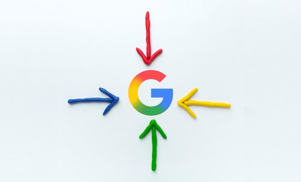
A major, yet interesting update from the tech giant, Google! It’s giving a super fresh makeover to the iconic “G” logo, changing the color schemes. End of an era for the old logo!
This marks a solid change after almost a decade, when Google updated its font to a Product Sans typeface and went with the solid-colored “G” in September 2015.
What’s New in the “G” Icon?
The super new “G” icon now blends four colors together, red, yellow, green, and blue, creating a rainbow gradient effect. It goes like this: red bleeds into yellow, yellow into green, and green into blue.
![]()
Indeed, a focus on subtle, vibrant, and fluid appearance, while reflecting Google’s move towards generative AI and adapting modern designs. Alongside, the revamped version also goes in line with the gradient colors Google uses for Gemini AI, which is a blue-purple gradient.
The “G” logo is currently active for iOS users via the Google search app and has begun to show up on Android devices with Google’s app beta version 16.8. The amazing rollout is all set to go live on different devices in the coming weeks.
A Purpose-Driven Change!
Well, in today’s digital world, change is the new norm! Similarly, Google continues to remain ahead of the curve. The new logo with focus on gradients is not simply a change in aesthetics; moreover, a big shift from Google to stand as a dynamic and evolving power in the tech industry.
We’re certainly unsure whether the new update is to change across Google’s services, such as Chrome, etc., or if it is in the experimental stage. Certainly, users absolutely love the new visual appearance of the logo! Google’s step up seems to be remarkable and is for sure to make a big impact in its growth and success in the digital age.
Stay tuned with all the tech trending news here: Hitechnectar
Also Read:
Google Veo 2 vs. OpenAI Sora: Which AI Video Content Creator Is Best?
What’s the Google Search Generative Experience (SGE) Wave All About? Know Here


